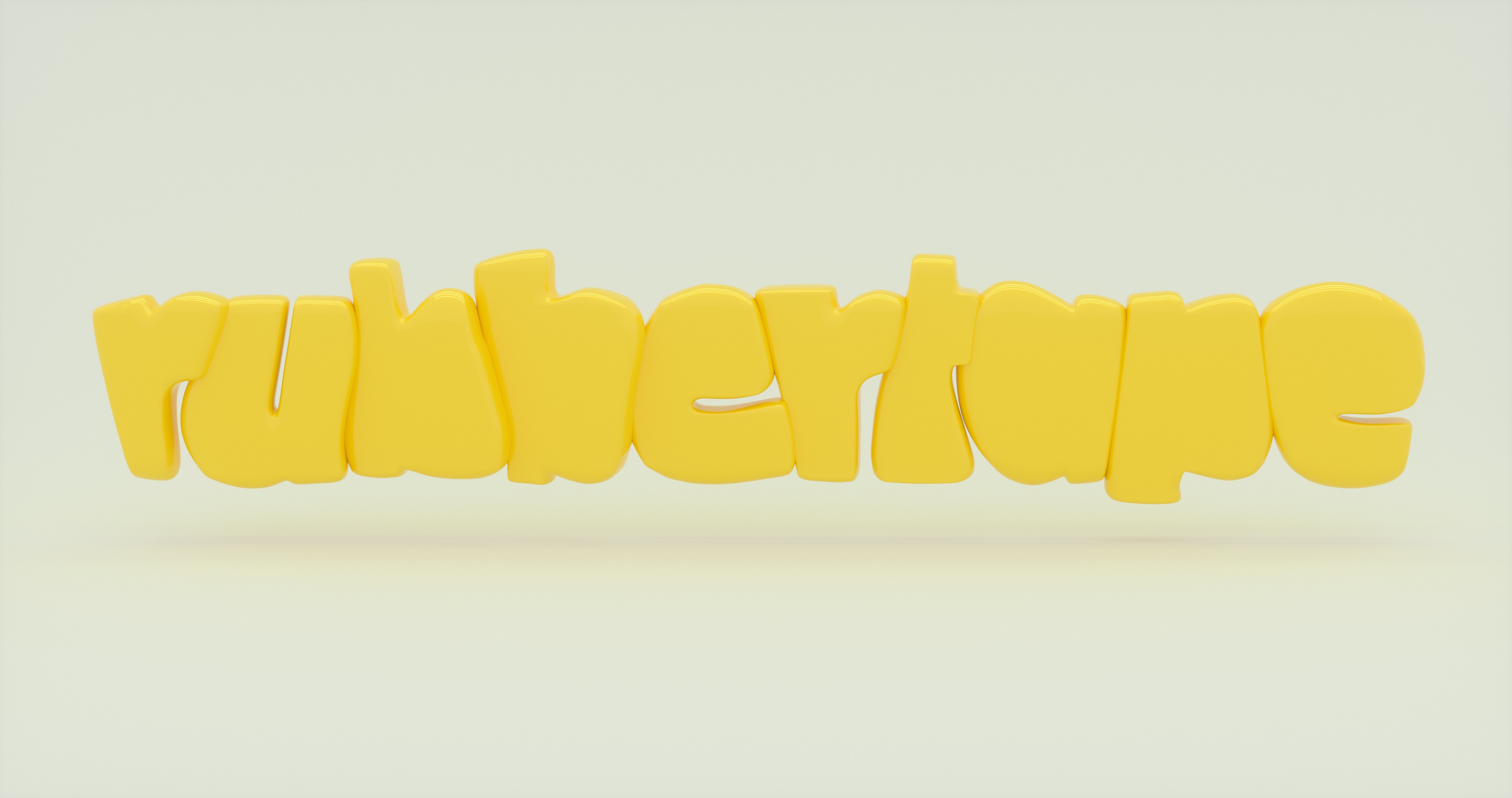
Rubbertape logo's primary source of inspiration was drawn from the idea of taking up space. Adapting, molding, changing. It needed to feel dynamic and playful all while maintaining a sense of structure and refinement. Something that said, these guys know what they're doing, but still wear jeans around the office. Jonas, the company's CCO, knew from the beginning he wanted a chunky wordmark, with lowercase letterforms and a mustard yellow and white palette (swoon), designed to exist primarily in the 3D landscape. This is where we landed.